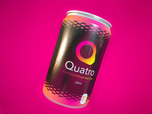
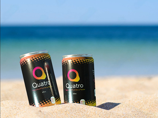
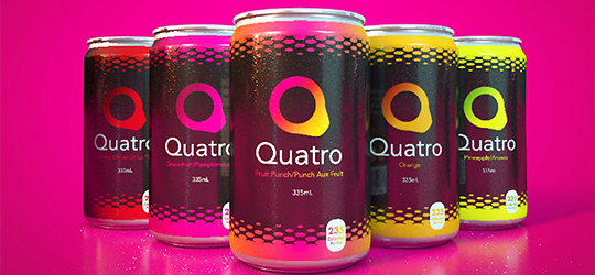
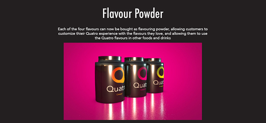
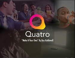
Case Study

Mobile Menu

Quatro Rebrand

Project Roles: Motion Design, 3D Design, Graphic Design, Front End Dev

Client: Quatro

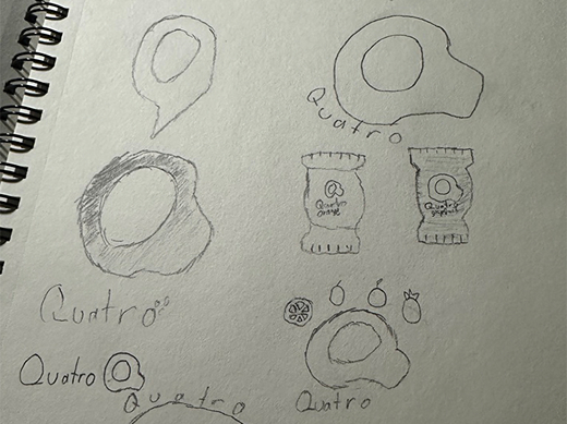
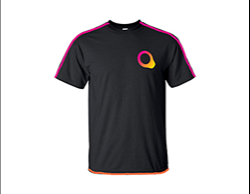
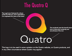
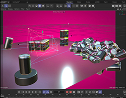
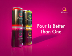
Deliverables: Logo and brand guidelines(Graphic Design), advertisements(Graphic Design, 3D), video promo(3D, Motion Design), website(Web Design, Front-End Dev)

2025-01-03 - 2025-04-14

Background

During my second semester at Fanshawe, I was asked to do a rebranding of the drink brand, Quatro, a pop made up of four combined fruity flavours. Quatro was an old drink that’s gone out of business, so my job was to try and bring it back into the modern age.

An image of the newly designed Quatro can

The Project

A picture of two cans of Quatro in the sand at the beach

The goal was to take something old and modernize it for a new audience, reviving the brand and making it something new and unique. The project required new branding, a new ad campaign, and a new website. This project aimed to use everything I’d learned about branding, web design, and 3D to revive an old brand and make something quality and appealing.

The Issues

  • Not enough variety to complete enough posters of the cans
An image of the 5 flavours of Quatro lined up

The Fixes

  • Create additional elements to go alongside the cans
A screenshot of Quatro flavour packets, explaining what they are

Process

I first decided what Quatro was, defining the target audience and brand characteristics and providing the basis of what the designs would be built off of. Once the brand identity was established, I created the logo and brand guidelines with things like typography and colours.

Once the brand and its design rules were created, I created can designs and 3D can models, which I then used to create posters and a commercial. I then took everything that had been created to make a brand-coherent and engaging website to advertise and sell Quatro

A picture of early sketches of ideas for the Quatro logo An image of a mockup for a Quatro t-shirt A screenshot of the Quatro styleguide explaining the parts of the logo A screenshot of 3D models of the Quatro can being worked on An image of the title slide of a Quatro commercial brief

Results

An image of a can of Quatro with the words Bring it All Together beside it

Impact & Final Product

Quatro was my first time doing a full, start-to-finish brand explanation, giving me a very educational experience in branding and working on a brand from scratch. This was also my first major project done using Cinema4D and InDesign, so it was a good opportunity to learn new software.

A picture of a bor drinking Quatro on the beach
An image of a pink semi truck with a Quatro banner on the side An image of a poster with the 4 singled out Quatro flavours and the text, Four is Better than One
An image of a poster of the 5 Quatro flavours and the text, The Choice is Yours

Looking Back

Quatro was my first time doing a full, start-to-finish brand explanation, giving me a very educational experience in branding and working on a brand from scratch. This was also my first major project done using Cinema4D and InDesign, so it was a good opportunity to learn new software.